Here’s a quick tutorial on jQuery Mobile. We’ll start with a standard HTML file, then add the jQuery elements in. Code and comparisons are provided. Just like the official jQuery documentation, we will be using div instead of the newer HTML5 semantic elements like header and footer. You can use the HTML5 elements, but remember to use HTML5 shiv if you want to support older browsers.
We start with a standard HTML with a header, menu, list, form and footer. It looks like this.
 The HTML code is
<!DOCTYPE html>
<html>
<head>
</head>
<body>
	<div id="page">
		<div id="header">
			<h1>Header</h1>

			<div id="navbar">
				<ul>
					<li><a href="#">Menu 1</a></li>
					<li><a href="#">Menu 2</a></li>
				</ul>
			</div>
		</div>

		<div id="content">
			<p>Paragraph...</p>

			<ul id="listview">
				<li id="list-divider">List Divider</li>
				<li><a href="#">List Item 1</a></li>
				<li><a href="#">List Item 2</a></li>
				<li><a href="#">List Item 3</a></li>
			</ul>

			<form>
				<fieldset>
					<legend>Form Legend</legend>

					<div>
						<label for="input1">Input 1</label>
						<input id="input1" />
					</div>

					<div>
						<label for="input2">Input 2</label>
						<input id="input2" />
					</div>

					<div>
						<label for="toggle">Toggle</label>
						<select id="toggle">
							<option value="off">Off</option>
							<option value="on">On</option>
						</select>
					</div>

					<div>
						<input id="checkbox" type="checkbox" />
						<label for="checkbox">Checkbox</label>
					</div>

					<div>
						<input type="submit" value="Submit" />
					</div>
				</fieldset>
			</form>
		</div>

		<div id="footer">
			<h4>
				Footer
			</h4>
		</div>
	</div>
</body>
</html>
Nothing special here so far. Now we add jQuery Mobile in. First we add the jQuery Mobile JavaScript and CSS in the head. The viewport meta tag is needed so mobile browsers don’t display the page zoomed out.
<head>
	<meta name="viewport" content="width=device-width, initial-scale=1" />

	<link rel="stylesheet" href="https://ajax.aspnetcdn.com/ajax/jquery.mobile/1.2.0/jquery.mobile-1.2.0.min.css" />
	<script src="https://ajax.googleapis.com/ajax/libs/jquery/1.8.2/jquery.min.js"></script>
	<script src="https://ajax.aspnetcdn.com/ajax/jquery.mobile/1.2.0/jquery.mobile-1.2.0.min.js"></script>
</head>
Next we add the HTML5 data attributes in. These attributes are used by jQuery Mobile for markup-based initialization and configuration of widgets. We add it in the page, header, navbar, content, list, form, and footer. Here are the difference between the original HTML and the HTML with jQuery.
 Our page now looks like this.
 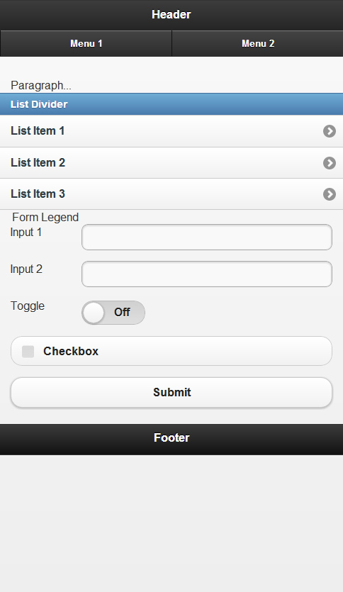 The code is now.
<!DOCTYPE html>
<html>
<head>
	<meta name="viewport" content="width=device-width, initial-scale=1" />

	<link rel="stylesheet" href="https://ajax.aspnetcdn.com/ajax/jquery.mobile/1.2.0/jquery.mobile-1.2.0.min.css" />
	<script src="https://ajax.googleapis.com/ajax/libs/jquery/1.8.2/jquery.min.js"></script>
	<script src="https://ajax.aspnetcdn.com/ajax/jquery.mobile/1.2.0/jquery.mobile-1.2.0.min.js"></script>
</head>
<body>
	<div data-role="page">
		<div data-role="header">
			<h1>Header</h1>

			<div data-role="navbar">
				<ul>
					<li><a href="#">Menu 1</a></li>
					<li><a href="#">Menu 2</a></li>
				</ul>
			</div>
		</div>

		<div data-role="content">
			<p>Paragraph...</p>

			<ul data-role="listview">
				<li data-role="list-divider">List Divider</li>
				<li><a href="#">List Item 1</a></li>
				<li><a href="#">List Item 2</a></li>
				<li><a href="#">List Item 3</a></li>
			</ul>

			<form>
				<fieldset>
					<legend>Form Legend</legend>

					<div data-role="fieldcontain">
						<label for="input1">Input 1</label>
						<input id="input1" />
					</div>

					<div data-role="fieldcontain">
						<label for="input2">Input 2</label>
						<input id="input2" />
					</div>

					<div data-role="fieldcontain">
						<label for="toggle">Toggle</label>
						<select id="toggle" data-role="slider">
							<option value="off">Off</option>
							<option value="on">On</option>
						</select>
					</div>

					<div data-role="fieldcontain">
						<input id="checkbox" type="checkbox" />
						<label for="checkbox">Checkbox</label>
					</div>

					<div>
						<input type="submit" value="Submit" />
					</div>
				</fieldset>
			</form>
		</div>

		<div data-role="footer">
			<h4>
				Footer
			</h4>
		</div>
	</div>
</body>
</html>
Nice, just the addition of a few data attributes and we have a nicely formatted mobile page. Now let’s add a few more data attributes, to make our page a little fancier before we wrap up. Let’s add some data-transition, data-inset, data-icon, and data-position attributes. The differences are  The page now looks like:
  And the final code looks like:
<!DOCTYPE html>
<html>
<head>
	<meta name="viewport" content="width=device-width, initial-scale=1" />

	<link rel="stylesheet" href="https://ajax.aspnetcdn.com/ajax/jquery.mobile/1.2.0/jquery.mobile-1.2.0.min.css" />
	<script src="https://ajax.googleapis.com/ajax/libs/jquery/1.8.2/jquery.min.js"></script>
	<script src="https://ajax.aspnetcdn.com/ajax/jquery.mobile/1.2.0/jquery.mobile-1.2.0.min.js"></script>
</head>
<body>
	<div data-role="page">
		<div data-role="header">
			<h1>Header</h1>

			<div data-role="navbar">
				<ul>
					<li><a href="#" data-transition="slide" data-icon="home">Menu 1</a></li>
					<li><a href="#" data-transition="slide" data-icon="gear">Menu 2</a></li>
				</ul>
			</div>
		</div>

		<div data-role="content">
			<p>Paragraph...</p>

			<ul data-role="listview" data-inset="true">
				<li data-role="list-divider">List Divider</li>
				<li><a href="#" data-transition="slide">List Item 1</a></li>
				<li><a href="#" data-transition="slide">List Item 2</a></li>
				<li><a href="#" data-transition="slide">List Item 3</a></li>
			</ul>

			<form>
				<fieldset>
					<legend>Form Legend</legend>

					<div data-role="fieldcontain">
						<label for="input1">Input 1</label>
						<input id="input1" />
					</div>

					<div data-role="fieldcontain">
						<label for="input2">Input 2</label>
						<input id="input2" />
					</div>

					<div data-role="fieldcontain">
						<label for="toggle">Toggle</label>
						<select id="toggle" data-role="slider">
							<option value="off">Off</option>
							<option value="on">On</option>
						</select>
					</div>

					<div data-role="fieldcontain">
						<input id="checkbox" type="checkbox" />
						<label for="checkbox">Checkbox</label>
					</div>

					<div>
						<input type="submit" value="Submit" data-icon="check" data-theme="b" />
					</div>
				</fieldset>
			</form>
		</div>

		<div data-role="footer" data-position="fixed">
			<h4>
				Footer
			</h4>
		</div>
	</div>
</body>
</html>
For more information, read the jQuery Mobile demos & documentation and play around with Codiqa, a prototyping and interface-building tool for jQuery Mobile.